Search Engine Optimisation & HTML5 Websites

HTML5 Responsive
This specific website is a fully-responsive, HTML5 template site designed in-house and should be usable on most devices including mobile phones, tablets, netbooks, laptops and desktops, it automatically adjusts in portrait or landscape mode for whichever device is used and is an all-in-one solution. It is very search engine friendly and can rank very highly for many competitive keyword terms.
Search Engine Optimisation (SEO) and HTML5 website upgrades are what we do mostly these days, many sites constructed in the past few years may not need a site re-build, however we see many sites which have been very nicely designed yet are not / poorly optimised for the search engines simply because the "designer" had little or no experience in SEO. Quite simply, they do not teach that at school because they don't know what it is!
Why is a responsive website so important? Simply because 59.93% of gobal website visitors (July 2024 to July 2025 & New Window) use mobiles & tablets in their viewing therefore if your site is not responsive it may easily not be legible, consequently potential visitors may very easily click away from your site.
As you can see we have used two columns, four columns and three columns assuming you are viewing on a desktop, more columns are not a problem however we would not recommend using six or more since it makes for difficult reading and when your promotional messages cannot be read they lose their relevance.
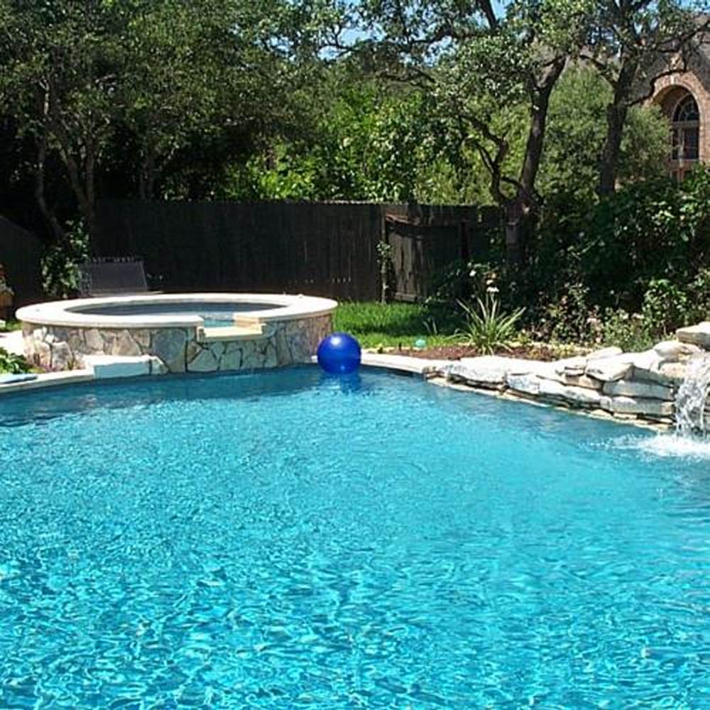
Images can make or break a website therefore ensure you use the most applicable photographs you have to promote your business products no matter your trade, people equate quality images with the quality product and service they are going to get. The quality of phone cameras these days makes it very easy for anyone to take good photographs.
Welder

Click on this photo and see it enlargen to a 1,000 x 1,000 pixel image, these pop-up images can be made very large and will adjust automatically to the device's screen.


